~and now for some artist commentary~
why this drawing
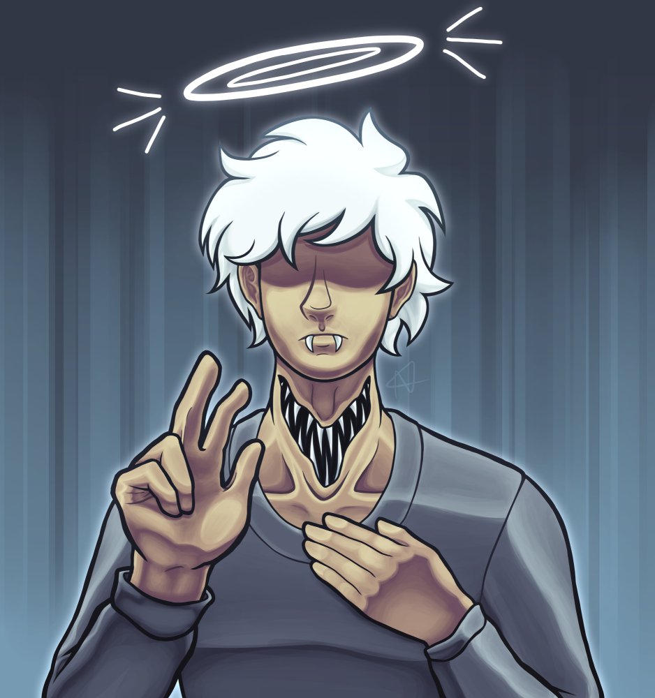
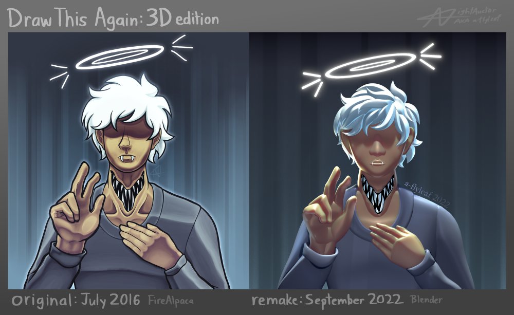
The original was drawn on a whim. I’ve liked it for a while and, while there are some things I would draw differently nowadays (I think I would want to color the lineart more, the background + halo were afterthoughts, and the hair lacks contrast), it’s never been enough to justify an all-out redraw.
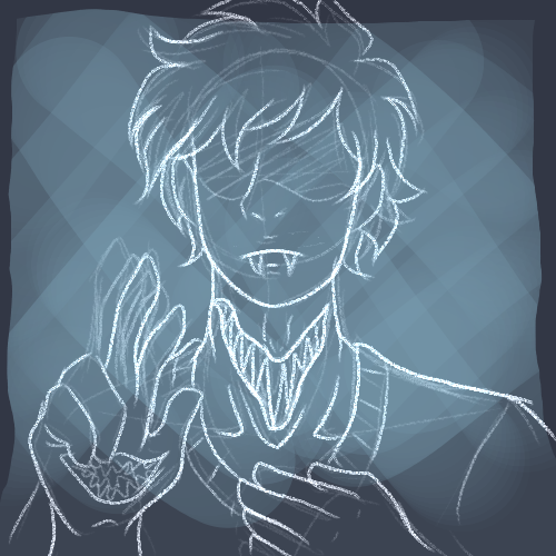
[Image descripton: Original sketch for the drawing. Looks roughly the same as final except as noted below:]
NGL I completely forgot there was going to be a mouth on the hand until digging this up.
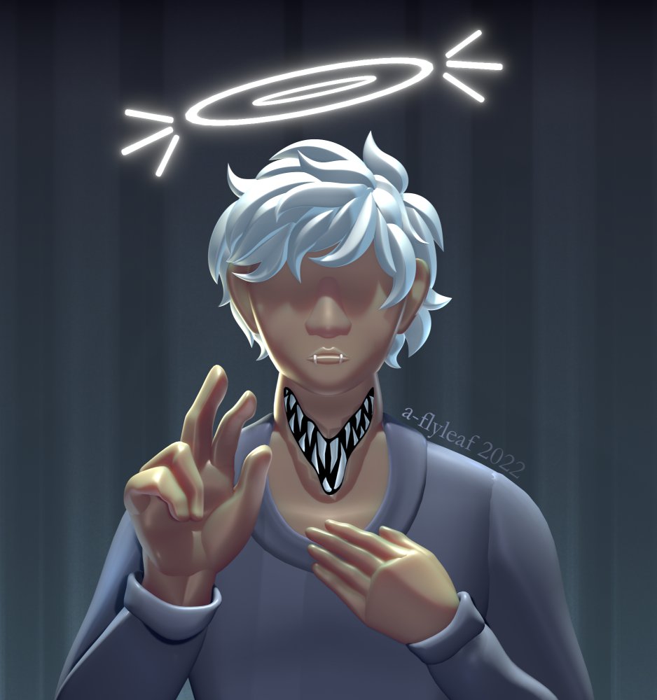
Recently I’ve been learning 3D via Blender, and (also on a whim) got the idea to remake one of my drawings with it. This one came to mind instantly.
The Process: modeling
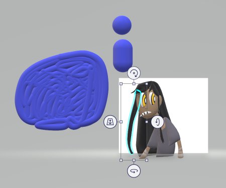
All-out sculpting was intimidating and I had no plans to animate, so I went for a style inspired by Paint 3D. The workflow looks similar to how I do lineless art, with each part being its own object; I’ve messed with the program before but once you create a shape it’s tricky to modify, and it’s unintuitive to export for modification in other programs.
[Image description: Screenshot of the one Paint 3D file I have saved. A big blob and a couple sphere-like shapes float off to the side; on the actual canvas is a very wonky character drawing. One piece of the hair is selected, showing options for rotation and scaling—but not, unfortunately, actual shape contour modification]
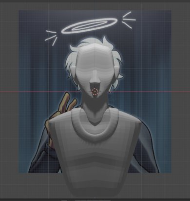
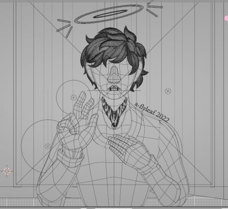
Blender + Solidify modifier (makes a flat plane look like a 3d surface) + Subdivision Surface modifier (makes a thing round) seemed viable for a lookalike—and, for the most part, it worked like a charm. Since the original drawing is fairly symmetrical, I “traced” it with vertex points and a Mirror modifier. (Unfortunately I didn’t screenshot the process, but later screenshots include the raw wireframe; it’s noticeably simpler than the curves shown below. Subsurface is magic.)
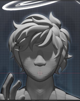
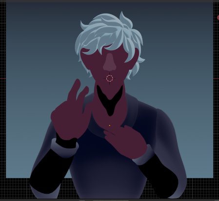
[Image description: Screenshot of the Blender UI, showing the untextured model in part (head, ears, nose, neck base, and torso with shirt collar). The original drawing is behind it.]
For the shadows, I moved the light overhead, then turned the planes into actual volumes by applying the Solidify. Rather than paint anything in or shape the form in a normal fashion, I messed with the Y-axis (pushing parts forward and back, essentially). Does the result make sense in actual 3D? Nah.
I thought, at one point, it might be neat to make the camera move a little bit, like those gifs where a flat picture looks 3D-ish through some photoshop magic. (Cannot find a good example for the life of me because I don’t know what you call that effect. Basically, imagine taking a picture, then shifting the camera back and forth a little.) But firstly, that would call for working in orthographic perspective (I did not), and also then I got to the irregular parts.
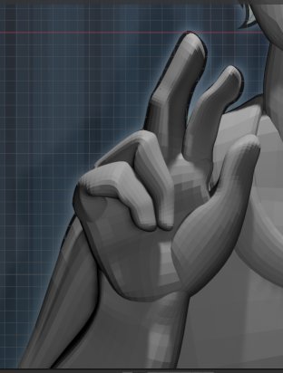
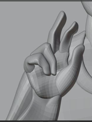
[Image description: Two views of the hand, one with full lighting and the other with default/preview lighting.]
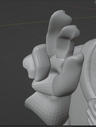
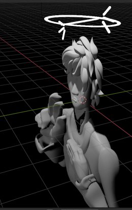
The hands, for instance, have complex shading in the drawing. I ignored the palm to an extent and got lazy with the folded fingers, but they look okay as rendered. But it looks weird if the light or camera is anywhere else.
[Image description: Another view of the hand, this time at a three-fourths angle. The geometry is severely distorted like semi-squished clay, with parts pulled forward and pushed back for no apparent reason.]
This is how lighting works, right?
For the hair, I followed this tutorial by YanSculpts (slightly outdated, see comments). If I ever tackle this style in 3D proper it’s gonna be a heck of a challenge. But fortunately, I only cared about the front view for this, and winging it was fun.
[Image description: A closeup on the hair. As with the rest of the model, it roughly follows the contours of the original drawing—now with a lot more strands to fill what the drawing left blank]
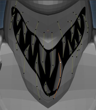
I used the same technique for the neck-teeth since I wanted them to have a little bend and didn’t feel like fussing with cone geometry. (I don’t actually know if there’s anything particularly difficult about cone geometry. This just seemed like a quicker solution.)
For the actual neck cutout, I modeled the mouth shape, overlapped it with the neck (and torso, since it intersects) objects, and used a Boolean modifier to “subtract” it. The shading is a little weird in the final render because the cutout has way more vertices than the neck itself, but I didn’t want to boost the neck subdivision because my computer doesn’t like high-poly models. But eh, I was also too lazy to model the veiny bits, so I don’t think it sticks out too badly….
The halo is just a couple of toruses (donut shapes) and some rounded cylinders for the glow lines, all with an Emission material. Considered animating this but I’m still trying to get a handle on parenting and transformations; for reasons unknown, things were being weird, so no fancy halo spins for today.
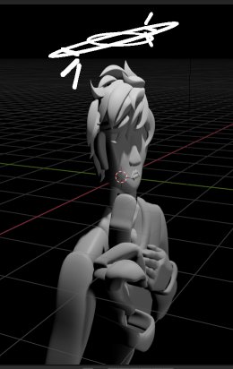
Have some final models at suboptimal angles.
Additional rambling on other bits of note; no detail screenshots, but visible above:
- The face fought me so bad. I don’t have a super 3D way of drawing faces in the first place, so rather than try to model it all in one go, I took a potato head approach and slapped the nose and mouth on top.
- Noses I’m a lot more comfortable with, though the one in the model here turned out wider than strictly intended. Also had to turn off the shadow for it because otherwise it covered the whole mouth/chin area. (It was either that or make it flatter and lose the highlight.) The mouth, meanwhie, cast either too much shadow or (after modeling tweaks) no shadow.
- I also didn’t quite indent the head enough to make the eye shadow curve where it does in the drawing, but ah well, the bangs probably would’ve thrown that off anyway.
- The sleeve cuffs were simultaneously a blessing (let me BS the wrist area more) and a curse (oh my god, getting it to wrap). The (viewer’s) left one follows the drawing contours much, much more closely, and it’s got a weird highlight because it sticks forward a ton. The right one is flatter/closer to the actual arm, but at the sacrifice of shape.
The Process: materials & lighting
Long story short, I do not understand the Principled BSDF shader but watched this a bunch and am trying my best. Also I had a small field day with emission gradients, though it only looks good on the hair; don’t quite know why it fades the way it does on the non-hair parts but oh well.
[Image description: A process screenshot of the model with no lights, showing some weird colors that I don’t understand enough about to adequately describe. The lower arms are a void because I hadn’t added the materials to them yet; the neck void, meanwhile, is intentional.]
For the most part, I tried to use the same colors as the original drawing, including the background gradient, but with some liberties for hair contrast. And then more liberties to make the shadows in general look better. And then I added a bunch more lights because why not.
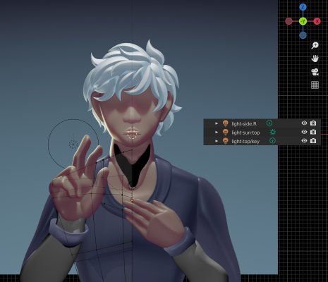
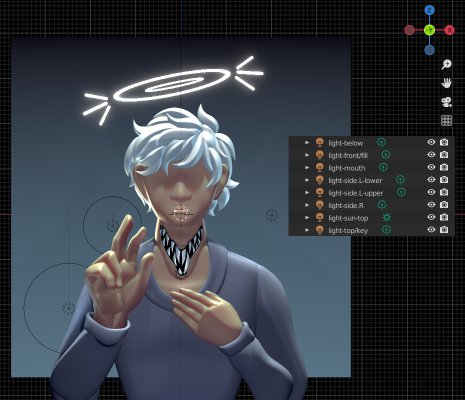
[Image description: Comparisons of the lighting, before and after. In the first screenshot there are only lights above and to one side; in the second, there are now lights underneath, in front, in the mouth, and three side lights total.]
Not an entirely fair comparison, since I still hadn’t added arm materials & had some parts hidden in the first screenshot, and the zoom levels are different. But for lighting purposes it works. (Also happen to have the torso wireframe visible in the first one.)
The shirt was also darker than the drawing at first; I think, but am not 100% sure, that that’s shown in the “before” screenshot. This was intended, to boost contrast, but later I made it light again and darkened the background instead.
The background was surprisingly tricky; I didn’t want to “cheat” and use an image, but I also made the original with a low-opacity brush and layer modes, which are not exactly options in Blender. (Well, I could have painted it, but since I didn’t do that for the model shading, made sense to follow suit.)
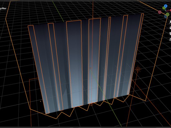
What I landed on was sticking a big area light underneath the background plane, then using a jagged invisible object to mess with shadows. (I don’t know why a see-through object casts shadows but hey, it works.) It’s not as intricate as the original but makes a similar effect, so #GoodEnough.
[Image description: An orthographic view of the background plane and its lighting weirdness. The area light is outlined in red (no clue why it’s invisible here), and the aforementioned shape is outlined in orange, as are sections where it intersects with the plane.]
I also added a couple lights inside the jagged-glass-shape. Effects are negligible but what else is art for if not poring over the tiny details. (There’s a subtle noise texture on the background too, if you squint; my first thought was to make the lights with the equivalent of a stretched noise overlay, but I don’t know nodes well enough to pull it off. Kept it in anyway, even though it’s not in the original, just for the heck of it.)
The Finished Product
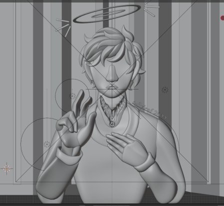
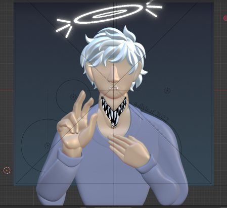
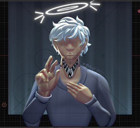
[Image description: Four versions of the final redo: wireframe (image contrast boosted for clarity), gray material preview, base material colors, and full render with lighting.]
No lineart because, bluntly, I was getting tired and wanted to be done. Remaking the original drawing 1:1 would’ve been very difficult if not impossible; some changes (hair contrast, darker background) were intentional, others were a byproduct of not thinking it through or just not wanting to mess with it more (some hand shading, neck detail).
But all things considered, I had fun, and I’m pretty dang happy with this! It took roughly 12 hours (all day, sparse breaks included—hence being tired at the end) and, on the heel of a couple days spent bereft of creative drive, was half a day well fucking spent.
…And that’s about all I have to say, considering this page was 90% process rambling :D I don’t even have any special commentary on the piece itself; I’m agnostic, I’m not religious, but I am not immune to thinking certain little bits of symbology look cool. And this is definitely not a tutorial or walkthrough (lord knows I am not experienced enough for that), I just made this because I had a lot to say and most of it wouldn’t have made sense without pictures.
[Image description: “Draw This Again: 3D edition”: a side-by-side comparison of the original drawing and the remake, as posted on deviantArt and my Toyshelf site. Both had minor contrast adjustments.]
Anyway, thanks for reading if you did! And if you didn’t, well, hope you got a kick out of the screenshots or something :P
…I have no idea how to conclude this \o/
