self-critique for the soul
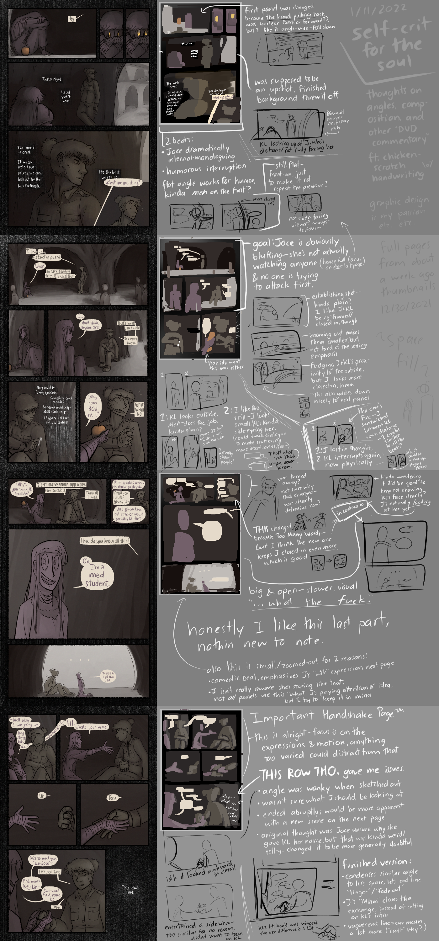
image description
A wall of comic on one side, thumbnails and commentary on the other. Notes transcribed below.
Was thinking about dynamic angles and cinematography and whatnot, wanted to revisit the recent comic scene.
Full transcript (click here)
self-crit for the soul
thoughts on angles, composition, and other “DVD” commentary, ft. chicken-scratch handwriting
[page 1]
- first panel was changed because the hand pulling back was unclear (back or forward?), but I like it angle-wise—[Joce’s] POV, [downshot]
- [This could theoretically still work in motion, but since it’s not in motion, it’s gotta go.]
- [second panel] was supposed to be an upshot, finished background threw it off
- [point of the panel:] KL looking up at J, who’s distant/not fully facing her
- BG wasn’t suuuper necessary tbh
- 2 beats [at the end]: Joce dramatically monologuing, humorous interruption
- flat angle works for humor, kinda meh on the first [preceding panel]?
- more closed in?
- [alternate version is] still flat—front-on, just to make it not repeat the previous?
- [another alternate version] not even facing viewer? ~mysterious~
[page 2]
- [page] goal: Joce is obviously bluffing—she’s not actually watching anyone (hence full focus on her last page), & no one is trying to attack first.
- [first panel is an] establishing shot—kinda plain? I like J+KL being “framed”/closed-in, though
- zooming out makes them smaller, but [I’m] not fond of the setting emphasis
- fudging J+KL’s proximity to the outside [in a third version], but J looks more closed-in, hmm
- this [curve formed by the setting] also guides [the eye] down nicely to next panel
- [middle row, panel] 1: KL looks outside. Meh—does the job, kinda plain?
- more J’s POV? with or w/o J on the side
- actually show people?
- [middle row, panel] 2: I like this, still—J looks small, KL’s kinda side-eyeing her. (could tweak dialogue to make stuttering more intentional, tho—)
- [middle row, panel] 1: J lost in thought, [panel] 2: KL interrupts again, now physically
- this one’s fine—J sandwiched between KL + own dialogue—1 can be similar to sell the beat?
- idk it could be a close-up [on the left]. tight focus.
[page 3]
- [in thumbnails, Joce] was turned away? not sure why that changed—more clearly defensive now?
- kinda wondering if it’d be good to keep not showing KL’s face clearly [in the top row]? J’s not really looking at her yet.
- This [corner panel] changed because Too Many Words—but I think the new one keeps J closed-in even more, which is good
- [Joce ignores KL + is closed-in by her dialogue should work] in contrast to [the middle row:] big & open—slower, visual “...what the fuck.”
- honestly I like this last part, nothin new to note.
- also this [last panel] is small/zoomed out for 2 reasons:
- comedic beat, emphasizes J’s “WTH” expression next page
- J isn’t really aware she’s staring like that. not all panels use this “what J’s paying attention to” idea, but I try to keep it in mind
[page 4, AKA] Important Handshake Page™
- this [upper third] is alright—focus is on the expressions & motion, anything too varied could distract from that
- This [last] row tho. gave me isssues.
- angle was wonky when sketched out
- idk it looked awkward in detail
- entertained a side view—too similar [to the top panel] for no reason, didn’t want to focus on KL
- wasn’t sure what J should be looking at
- ended abruptly; would be more apparent with a new scene on the next page
- original thought was [that] Joce was unsure why she gave KL her name, but that was kinda weird/tell-y. changed it to be more generically doubtful
- angle was wonky when sketched out
- finished version:
- condenses similar angle to less space, lets end line “linger”/“fade out”
- J’s “Mhm” closes the exchange, instead of cutting on KL’s intro
- vaguer end line = can mean a lot more (“[This] can’t [last]” why?)
- +KL’s left hand [being added to the handshake] was winged, the size difference is A Lot