Gary: character design notes

notes on the design notes

Hex color codes and height measurements need not be precise; they’re provided anyway for consistency. Relative colors (value + hue) and heights (where one character stands proportional to another) are more important.

Similarly, while some design details are key (for characterization and/or thematic reasons), others are a byproduct of art style; for instance, black and white are used fairly deliberately, but hair is often exaggerated for silhouette. There are also aspects where the distinction between diegesis and stylization is besides the point. I’ve tried to distinguish them as follows:

  • Important: Notes in bold & key traits should be maintained for recognizability.
  • Less important: Notes in gray are stylistic decisions on my part, and aren’t strictly necessary.
  • Notes without either format aren’t vital (i.e. if this was a book there’d be no need to describe these), but they’re not artistic quirks either. Take ’em or leave ’em.

These pages have a rudimentary mobile/single-column layout, but are ideally viewed on a larger, horizontal screen. The full layout has a fixed size, and is intentionally not responsive.

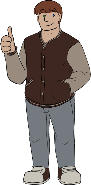
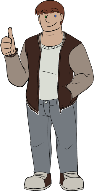
Two fullbodies of Gary; same relaxed, smiling pose, with one hand in his pocket and the other giving a thumbs up. The only difference is that his jacket is closed in one version and open in the other.

height

  • 5'7.5"
  • 171.45cm
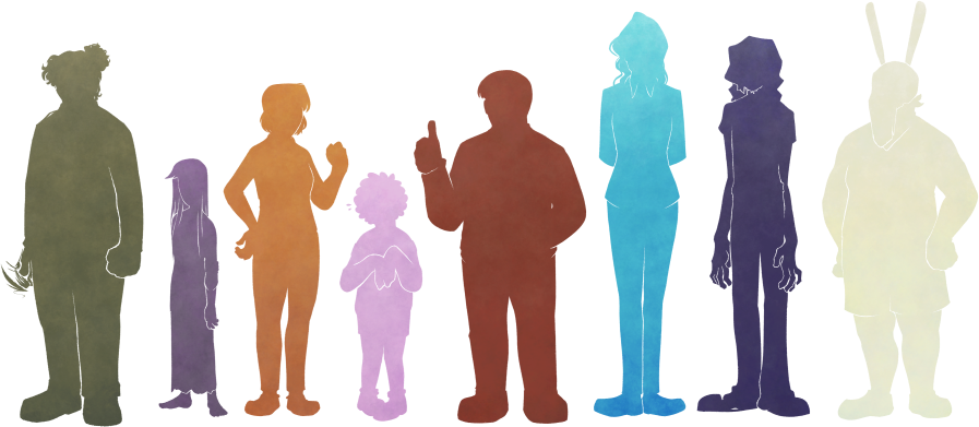
silhouettes of the main eight
Fifth-tallest of the main eight.

palette

main

Olive skin, short red-brown hair, and saturated heterochromic eyes (green on the viewer’s left, blue to the right). Hair is straight, short, and plain.

(skip hex codes)
  • #cfad94
    skin
  • #723e2c
    hair
  • #1e7930
    eye (right)
  • #3662d3
    eye (left)

outfit

Wears a two-tone mahogany-brown varsity jacket, blue-gray jeans, and sneakers that mostly match the jacket.

(skip hex codes)
  • #3e2720
    main jacket & sneakers
  • #9a8b7f
    jacket accents
  • #747a80
    jeans
  • #c8c4Ba
    sneaker whites
  • #daddd4
    sweater

key traits

Big, round, and pretty chill. Besides heterochromia, his palette doesn’t stick out; his gregarious attitude is less subtle. Soft varsity jacket is sometimes buttoned up, sometimes open, whatever he feels like.

Associated with reddish-brown.

actual notes

  • Made of round rectangles and friendly (that adjective is key) circles. Important: Not thin; more fat than muscle, with a wide neck and double chin.

  • Gary keeps it simple (which is important) and, as a stylistic touch, his eyes are basically just dots from any distance. When he looks around, the whole dots move; eyebrows help a lot to indicate direction.

    He could have freckles. He doesn’t, when I color him, because it would look weird with the (purely stylistic) lack of sclera.

    • Jacket shoulders are cut at sharp, wide angles; offset by softer fabric & Gary’s body shape.
    • Open jacket = more comfortable.
  • Jeans are tucked into sneakers, which have velcro straps.