about the character design notes
Based on the 2021 wall of design notes, but separate, updated, and (ideally) vastly more readable.
notes on the design notes
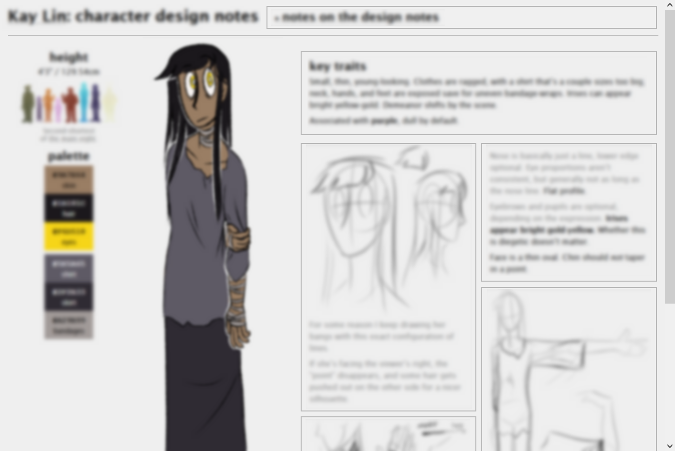
(repeated on each)Hex color codes and height measurements need not be precise; they’re provided anyway for consistency. Relative colors (value + hue) and heights (where one character stands proportional to another) are more important.
Similarly, while some design details are key (for characterization and/or thematic reasons), others are a byproduct of art style; for instance, black and white are used fairly deliberately, but hair is often exaggerated for silhouette. There are also aspects where the distinction between diegesis and stylization is besides the point. I’ve tried to distinguish them as follows:
- Important: Notes in bold are key traits & should be maintained for recognizability.
- Less important: Notes in gray are stylistic decisions on my part, and aren’t strictly necessary.
- Notes without either format aren’t vital (i.e. if this was a book there’d be no need to describe these), but they’re not artistic quirks either. Take ’em or leave ’em.
These pages have a rudimentary mobile/single-column layout, but are ideally viewed on a larger, horizontal screen. The full layout has a fixed size, and is intentionally not responsive.
This page will probably be revamped eventually. For now have the lineup again; these link directly to the design note pages.