Entirely a style thing: For some reason I keep drawing her bangs with this exact configuration of lines.
If she’s facing the viewer’s right, the “tip” disappears, and some hair gets pushed out on the other side for a nicer silhouette.
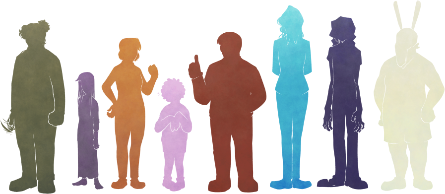
Hex color codes and height measurements need not be precise; they’re provided anyway for consistency. Relative colors (value + hue) and heights (where one character stands proportional to another) are more important.
Similarly, while some design details are key (for characterization and/or thematic reasons), others are a byproduct of art style; for instance, black and white are used fairly deliberately, but hair is often exaggerated for silhouette. There are also aspects where the distinction between diegesis and stylization is besides the point. I’ve tried to distinguish them as follows:
These pages have a rudimentary mobile/single-column layout, but are ideally viewed on a larger, horizontal screen. The full layout has a fixed size, and is intentionally not responsive.


Midtone skin, dark hair, and eyes typically colored gold-yellow. Hair is long, straight, and unadorned.
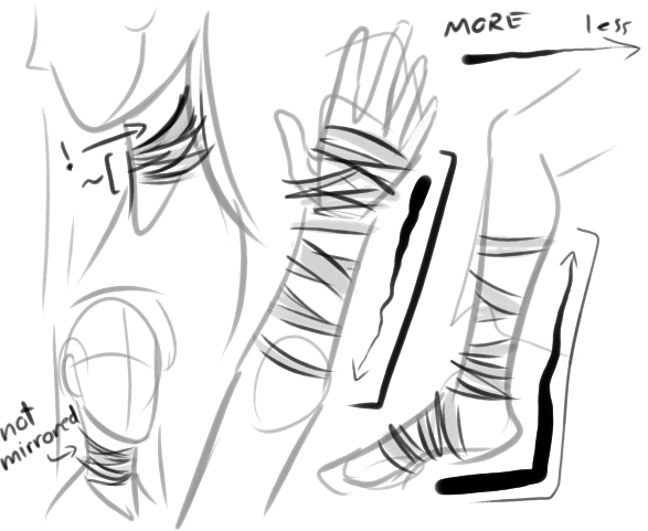
(skip hex codes)Wears an overlarge grayish shirt and a darker skirt. Dull bandages are wrapped around her neck, hands (trailing off up the arms), and feet.
(skip hex codes)Small, thin, young-looking. Clothes are ragged, with a shirt that’s a couple sizes too big; neck, hands, and feet are exposed save for uneven bandage-wraps. Irises can appear bright yellow-gold. Demeanor shifts by the scene.
Associated with purple, which is dull by default.

Entirely a style thing: For some reason I keep drawing her bangs with this exact configuration of lines.
If she’s facing the viewer’s right, the “tip” disappears, and some hair gets pushed out on the other side for a nicer silhouette.
Another style quirk: Nose is basically just a line, lower edge optional. Eye proportions aren’t consistent, but generally not as long as the nose line. Flat profile.
Eyebrows and pupils are optional, depending on the expression. Important: Irises appear bright gold-yellow. Whether this is diegetic doesn’t matter.
Face is thin and round. Chin should not taper in a point.

Exact configuration of bandage-wraps doesn’t need to be consistent*, but they trail off from the hands & feet. *Important Exception: One strip goes up the left (viewer’s right) side of the neck.

Important: T-shirt is way too big; most noticeable around the neckline (looser than it should be), sleeves (attached well below the arm & extended a little past the elbow), and bottom edge (terminates around the upper thigh).
“Skirt” is basically just a wrap of undecorated fabric.