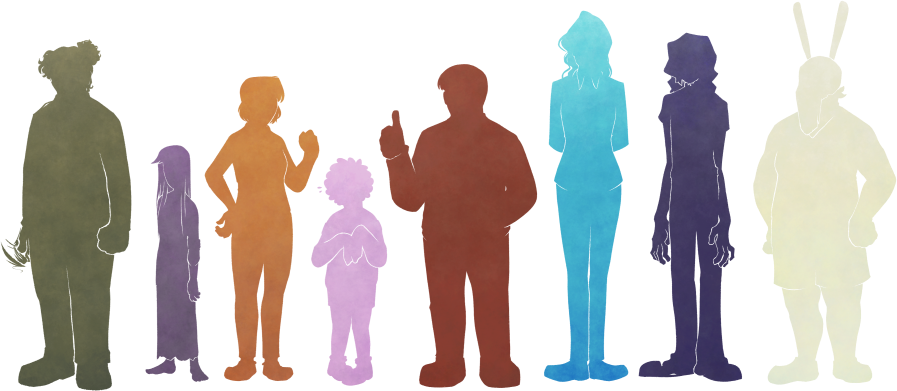
Hex color codes and height measurements need not be precise; they’re provided anyway for consistency. Relative colors (value + hue) and heights (where one character stands proportional to another) are more important.
Similarly, while some design details are key (for characterization and/or thematic reasons), others are a byproduct of art style; for instance, black and white are used fairly deliberately, but hair is often exaggerated for silhouette. There are also aspects where the distinction between diegesis and stylization is besides the point. I’ve tried to distinguish them as follows:
Important: Notes in bold are key traits & should be maintained for recognizability.
Less important: Notes in gray are stylistic decisions on my part, and aren’t strictly necessary.
Notes without either format aren’t vital (i.e. if this was a book there’d be no need to describe these), but they’re not artistic quirks either. Take ’em or leave ’em.
These pages have a rudimentary mobile/single-column layout, but are ideally viewed on a larger, horizontal screen. The full layout has a fixed size, and is intentionally not responsive.
Lanky to the point of boniness, hunch-necked, and looks like they just rolled out of bed. Slouches near-constantly [albeit not shown in reference for height clarity]. Striped sleeves and faded hair tips used to be brighter. Pajama pants and slippers all the way down.
Associated with indigo; saturation heavily varies.
actual notes
Important: Slouches severely, which can make them look shorter.
Longish neck with noticeable Adam’s apple; always bent forward to some degree, even when standing upright.
Defined, gaunt collarbone.
Important: Gangly limbs.
Somewhat big hands; frequently dangling at sides, held limp around torso, or absently picking teeth.
Hair is stylized with scraggly zigzags.Important: Bangs cover their right eye.
Rounder face with a tapering chin.
Important: Serious eyebags and stubble. Messy eyebrows, which (less important) match how I draw the rest of the eye. Sequitur has an eye color but, because of this stylization, it’s not discernible.
Big, wide nose; flat at the top, slopes down.
Important: Teeth are crooked.
Top is one piece, not a T-shirt over a long sleeve or armwarmers. Some trivia: It’sRiffed loosely from the ’90s–2000s-inspired look of 100 gecs, specifically from the 1000 Gecs album. Sleeve stripes are thin; count doesn’t matter.
Clothes in general are (importantly) very worn; shirt neck is is wide for lack of elasticity, logo is faded. Pajama-sweatpants are frumpy. Small wonder the slippers stay on.
Shirt logo is based on the “devil horns” or “rock on” hand sign (🤘), a gas mask, and (more loosely, initially by coincidence) a rabbit. (Also see concept brainstorming and solo art; both designs are outdated but get the idea across.)