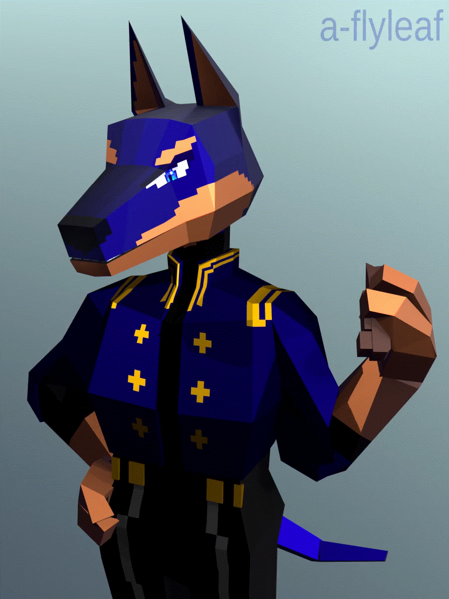
[image description: A gif of the model being shown off, a low-poly 3D model of an anthropomorphic Dobermann pinscher. The palette & outfit are modeled after /Arcane/ character Caitlyn Kiramman.]
whatever. dobermanns your kiramman
[All images are clickable & open the highres in a new tab. I’ve deliberately used lower-resolution pictures throughout this page, because there are A Lot Of Them.]
Woof.
prelude
Late February. You are sick for the second time in the calendar year, which you think is bullshit. Whilst languishing melodramatically, you recall that, having spent much of the previous month on a 3D video game, you’ve been wanting to get back into the medium yourself. (The, uh, 3D part. You know fuckall about game-making.)
As you have nothing better to do than zone out to social media and YouTube videos, you stumble upon an entire low-poly character modeling course.
Your fate is sealed.
cursory attempts
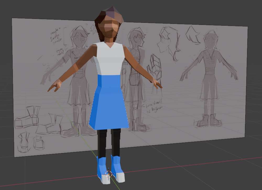
[image description: Low-poly A-posing human, with the reference image in the background.]
Your first venture is of course your own character. (You could follow the tutorial’s demo character, but you’ve done this before, and would rather wing it.) It is a good re-introduction to the program and how pixel-pushing in three dimensions works. You have no particular ambitions with it, but shiny new know-how that you absorbed from sicktime tutorial binging is already making your workflow much, much faster than the first time around.
Then you get lost in clothing confusion modifier hell. The file is set aside.
For your next attempt, you consider jumping off the deep end. Your actual character fixation du jour is some loser with blue hair and war crimes, and for convoluted reasons you will not be elaborating upon, you have taken to likening her to a dog. Specifically, this dog.
So, fuck it. Furry beam.
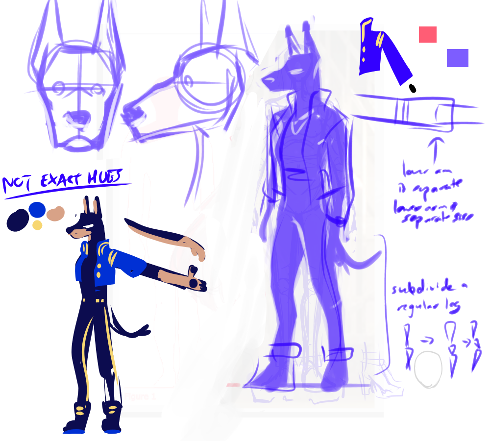
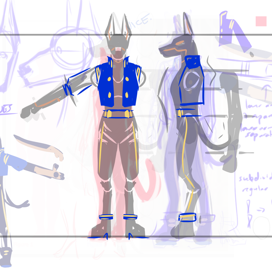
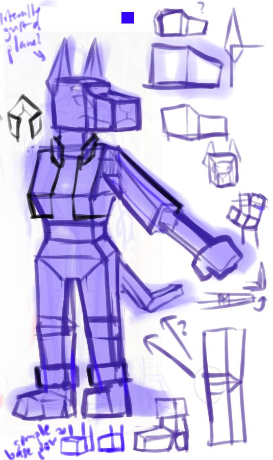
[image description: Assorted concept sketches for three-fourths, front, and side views of a Kiramman-based Dobermann.]
“hey what’s that red silhouette off to the side about” don’t worry about it. (The layers are a slight mess, yes.)
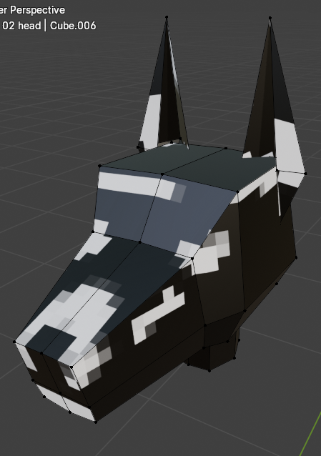
[image description: Two views of a partially-modeled kira-dobermann, orthographic front and the head in perspective.]
You get about this far before realizing
- you have no idea how the face edge loops work,
- you have no idea how the hand/paw edge loops work, and
- you’ve toyed with this high-poly nonsense before, to a limited degree, and… well, you didn’t hate it or anything. But you also remember it taking forever, and that was only a head. You don’t really want to take forever on this.
You’re also done typing in second-person, now.
the actual thign
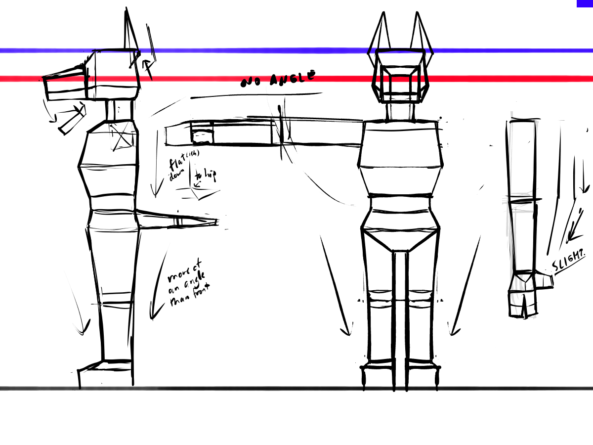
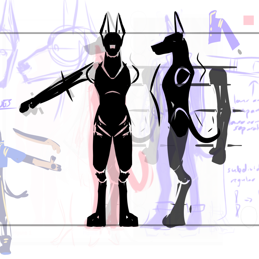
[image description: Concept sketches for the same dog, now built with all straight lines and sharp angles.]
You (the reader) might notice the eyes are only vaguely planned, and then absent from the turnaround altogether. Stick a pin in that.
Get blockified, idiot.
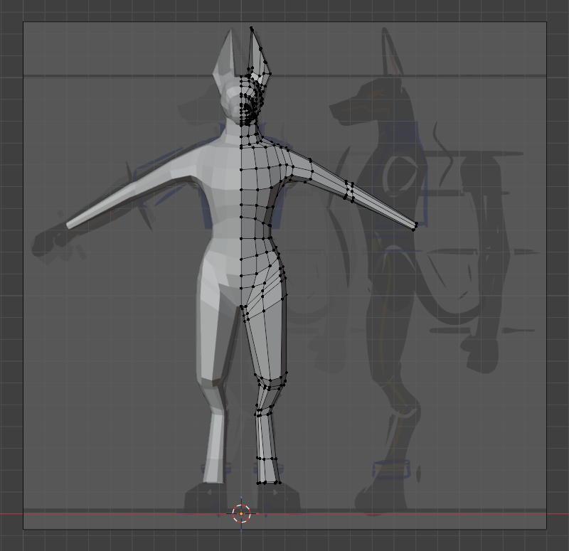
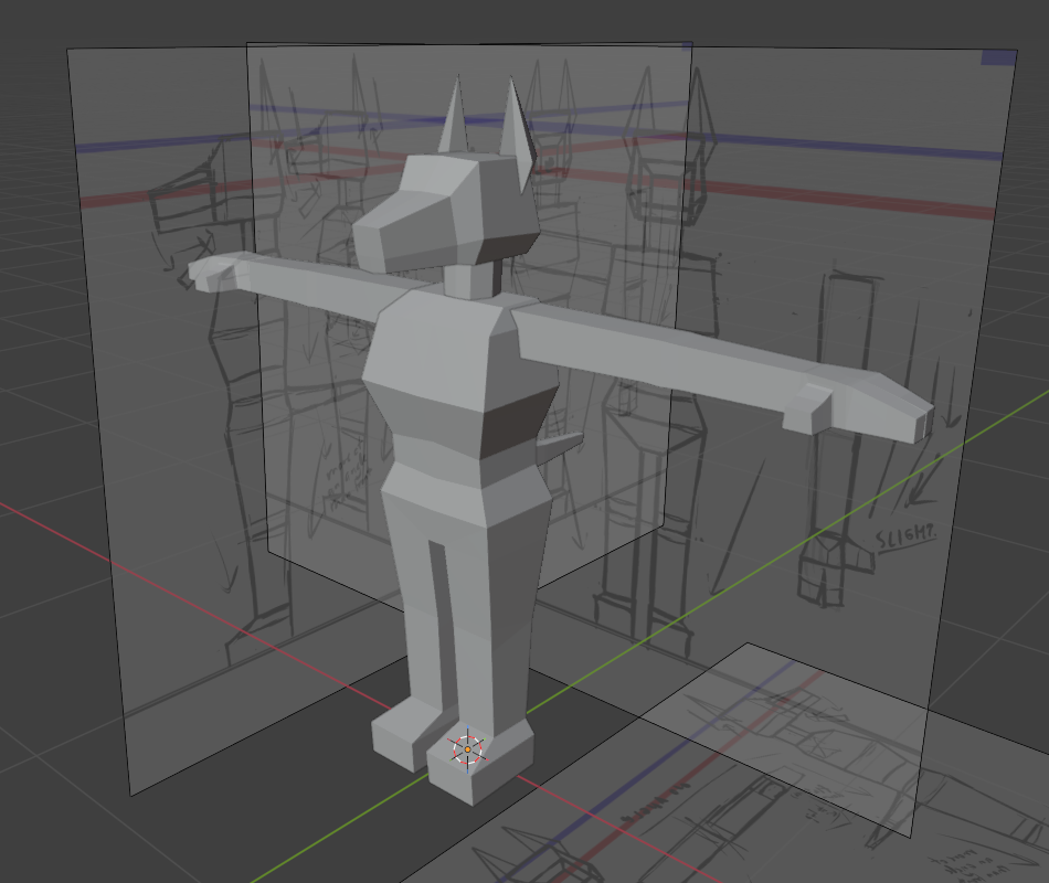
The anatomy immediately & deliberately changed from “dog standing on hind legs”-type anthro to “human with dog head & extremities”-style structure, mostly because I thought the latter would be simpler to model. (The legs. I’m talking about the legs. That seemingly-backwards bend in the dog-type legs was a pain in the ass to position right, and I have yet to mess with moving limbs that way in 3D.)
And it was, in fact, simpler! By the end of the day I had the whole thing fully made and done, all cubular.
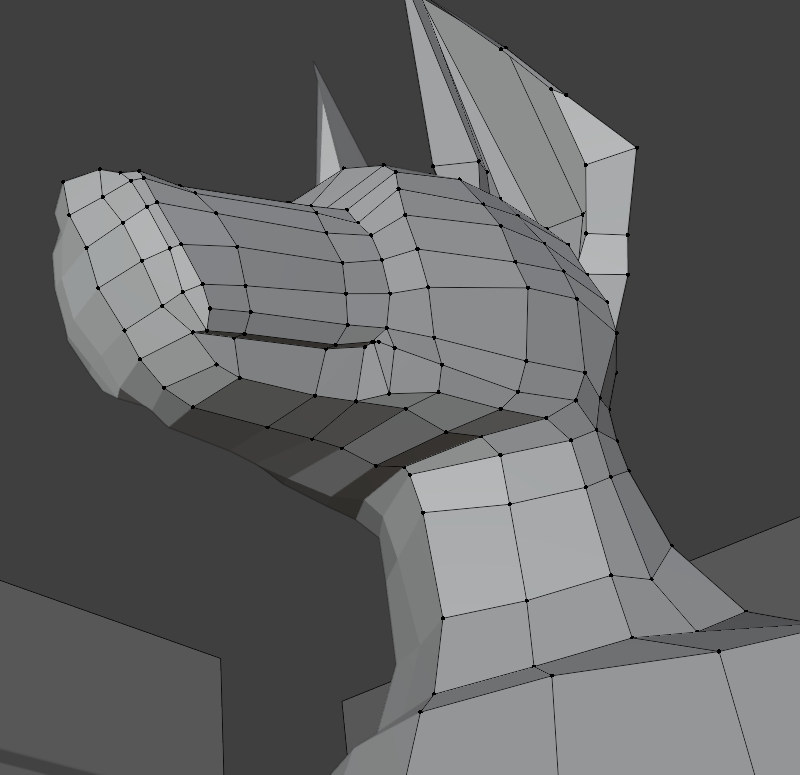
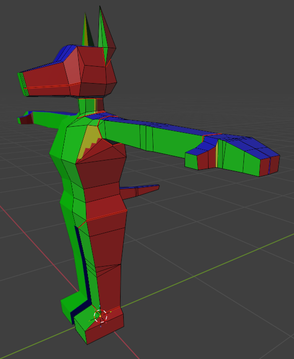
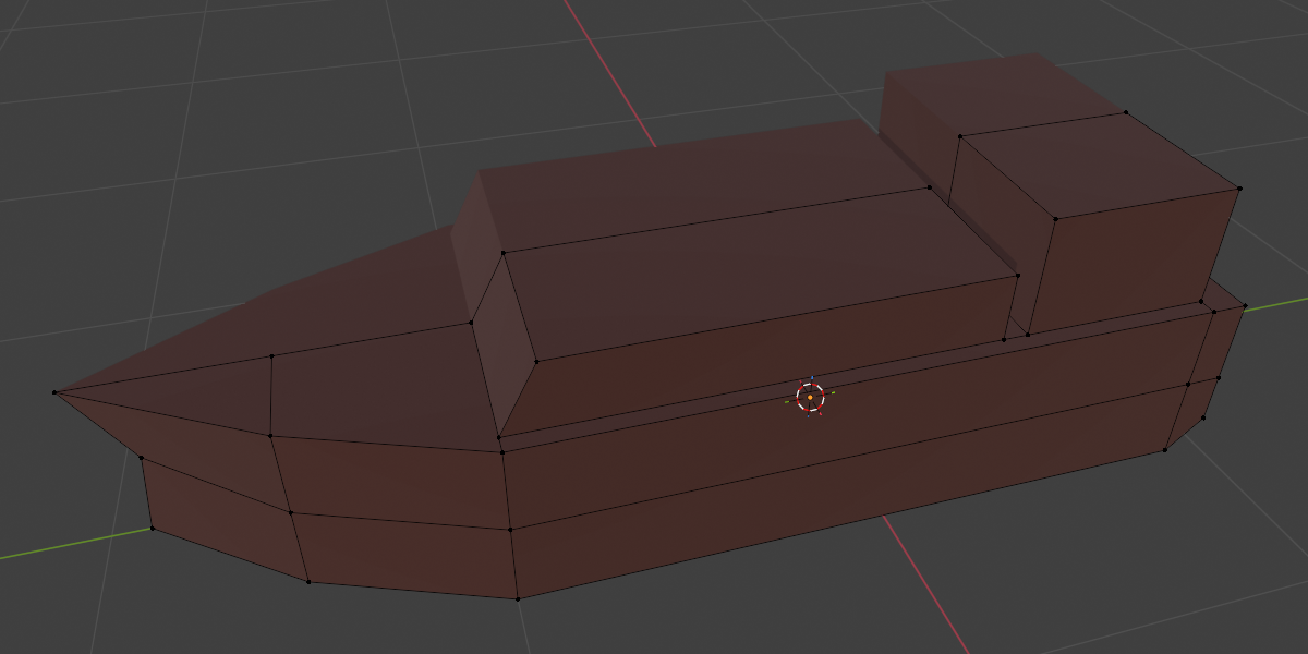
[image description: Blockier dob, now fully-modeled with disparate parts. Includes a close-up on the head, showcasing uneven vertices.]
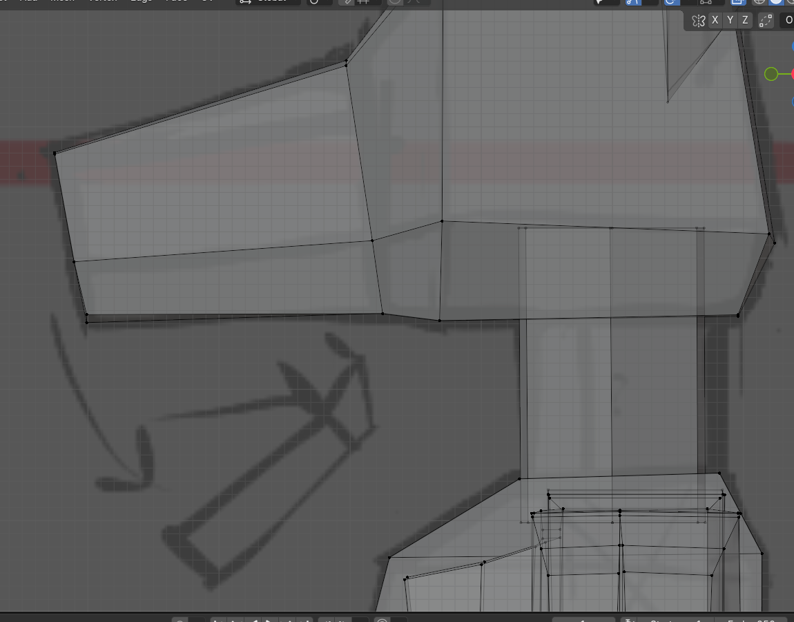
Tbh, I probably could’ve done it all even faster, if not for one teeny tiny minute detail that is ultimately unnoticeable to anyone who is not me: No right angles! In keeping with Arcane’s hand-crafted “no straight lines, no perfect circles, subtle asymmetry everywhere”* design philosphy, I deliberately freehanded most of the vertices. Or I’d snap them to the grid, then intentionally shove them around a little. Make the box model infinitesimally more organic, sure.
*Paraphrashing; citation needed. I can’t remember the exact quote, but this principle got highlighted in either the official artbook or somewhere in the season 1 behind-the-scenes. It’s been a while.
The markings weren’t particularly planned, but I thought a Minecraft-esque pixel style would fit the simplification nicely. So I did some quick automatic UV unwraps, scribbled on a texture to get a feel for how it might look, and called it a night.
[image description: Blockydob head, isolated, with pixelated splotches of white on black painted on. (The pixels do not line up across faces or at the corners.)]
model tweaks & clothing get
Theoretically, the mouth was supposed to open. Some face and edge futzing later, that got done. And then I was extra-possessed and decided to make the entire model one (1) continuous object.
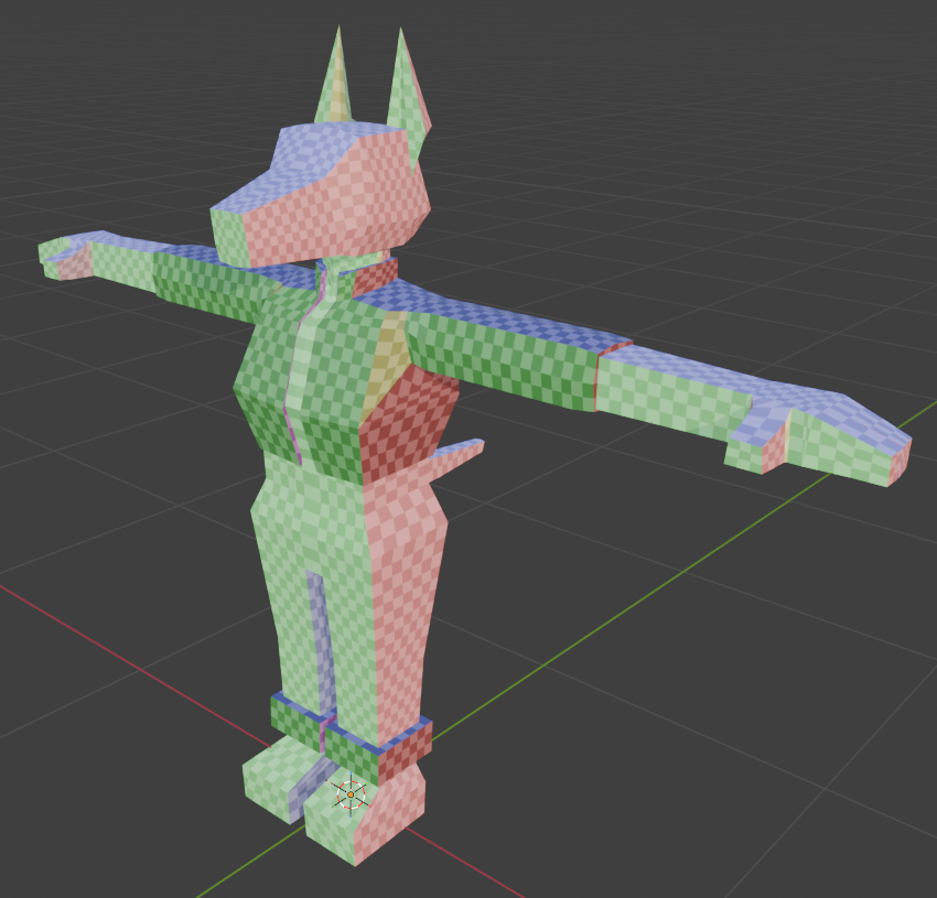
[image description: Two front views of the model, before and after merging everything into a single continuous object.]
Wireframe view (the second one) shows this off better. The face got an extra edge loop along the way, to keep the ear-to-head-to-neck faces flowing nicely. Notice that the legs don’t change at all, since those were continuous from the start.
Would it have been easier to just make the legs their own objects & emphasize the disconnect to mesh with all the other split parts better? Probably. I like the connected look better, though.
Moving on!
[image description: A preliminary UV unwrap, in which the entire texture is turned into a rainbow checkerboard.]
90% of the base model has the exact same solid color. (Gradient textures might be neat to mess with some time, but not this time.) Did I need to line up almost every pixel on almost every side, ensuring all the while that the sides are distinct & the UV maps don’t overlap? No.
And yet!
[image description: Yet another view of the dob, this time with solid colors on each axis: red on the side, green on front, blue on top.]
I also didn’t need to color-mark the front/back/outer side/inner side faces. (There was a mid-process version of this with the checkerboard pattern still present, but it’s since been lost in texture override hell.) Whatever. #hashtagEnrichment. I definitely know more about how UVs work now than I did before…!
There was a lot of back-and-forth nonsense between Blender and FireAlpaca (art program) here, btw. I thought it’d be clever to keep each part on its own layer, even if this meant re-exporting the PNG a billion times. At some point later in I gave up on this entirely, but an attempt was made.
Clothes got modeled along the way, to the extent that they’re modeled separately at all. As simplified from the original design: separate top & shoe cuffs, and everything else is part of the base texture.
[image description: In this view, the pixel checkers is back, and the noted parts of the outfit are clearly different objects.]
The belt clasp-things got split off at a later stage, for extra shine.
Heels, meanwhile, I did not bother with at all. I modeled flat feet and wasn’t sure what the logistics would be for lifting & moving the armature with some distance from the ground.
These, I did keep snapped to the grid, all right-angled and front-back vertices overlapping. The shoulder area especially got simplified, compared to the confused tri-quad fuckery of the base model. I knew, from some other tutorials, that it should be possible to move both clothes and base model together seamlessly..ish. I probably could’ve gone back and simplified the base shoulders, too, but w/e I had to call it #GoodEnough and move on.
no one nodes
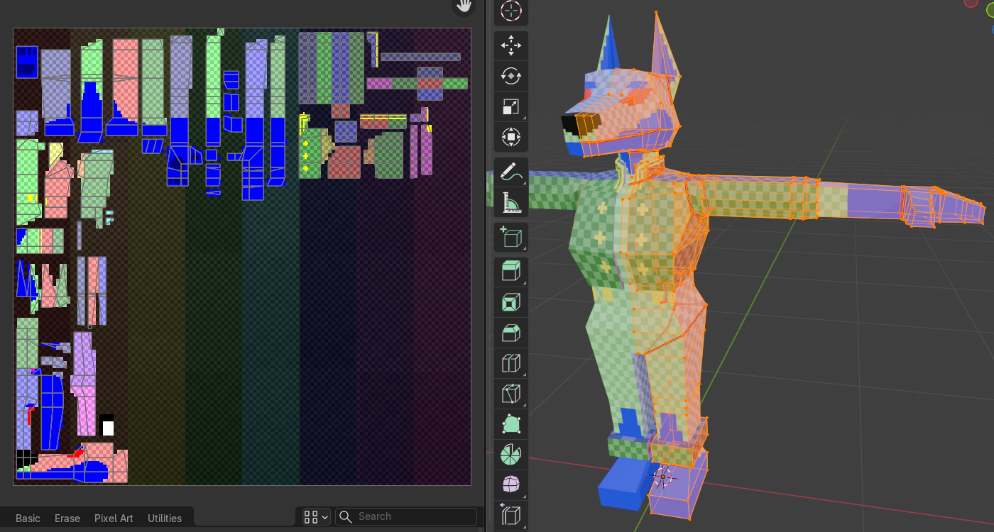
[image description: The checkered version, now with blocked-out markings on the base and clothes.]
There was, at this point, a small dilemma. I hadn’t decided on exact base colors, and thought it might be fun if I could edit those directly in Blender. I also knew the not-separately-modeled clothing would be on an overlapping 2D-layer, and although I had (and still have) no real plans to swap it out, it’d be neat if that’s a thing that could be done. And, I wanted certain details like the metallic trim to use a different texture entirely, react a little differently to light. (The tutorial uses a flat, shadeless look, but I like more control over the light source and mood.)
In other words: want texture to Have Layer.
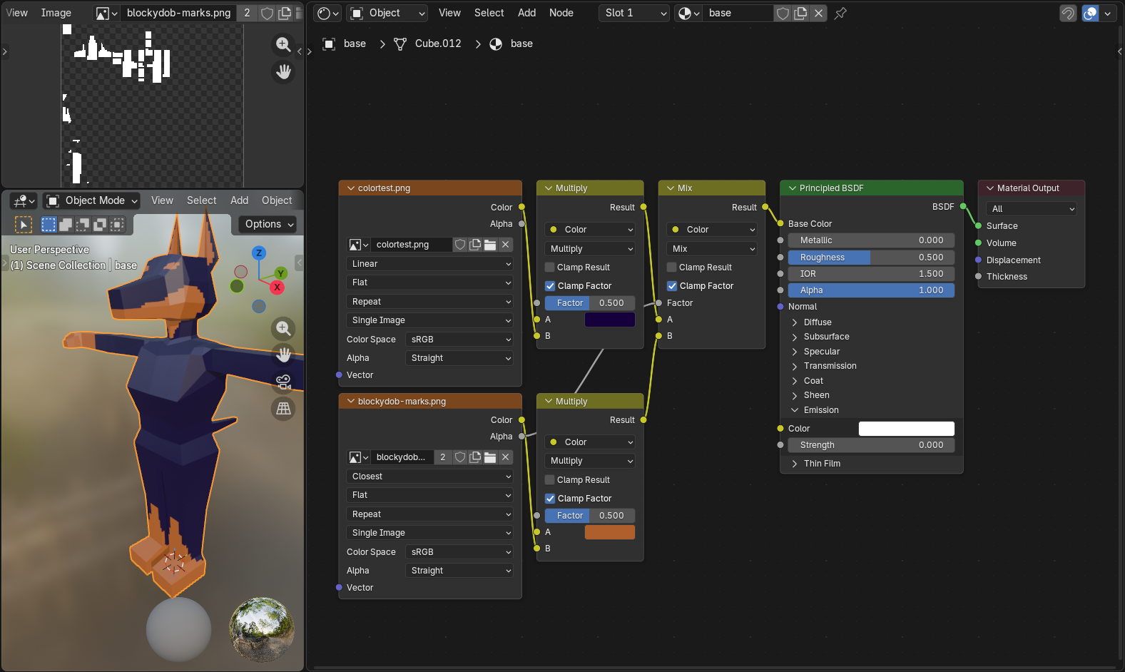
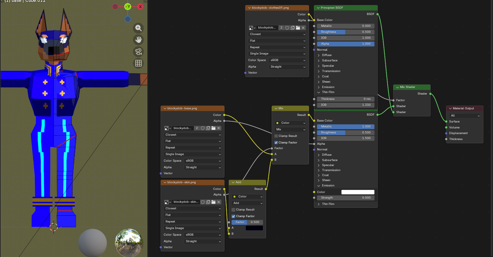
[image description: A preview of the initial node setup, as explained below, with the marking image & full base model off to the side.]
This got… more complicated, later, but this is the base of the thing.For those curious (and my own future reference): [click for dropdown]
- A single image texture can get plugged directly into the shader (in this case, Pricipled BSDF), Color to Base Color.
- Multiple images can be combined with the Mix Color node. The base image gets plugged into A; the overlapping layer connects to B, with the Alpha to the Mix Factor (ensures transparency).
- For this use case, the marking image uses fully white (
#FFFFFF) silhouettes; the color is added with a Multiply node (Mix Color with the second dropdown set to Multiply), with A as the desired color & B connecting the image itself.
- You can also accomplish this using black
#000000image silhouettes with an Add/Screen node, and probably other color blending modes. It’s more or less the same as any image editing program. - Important: The UVs are exactly the same for both images. If you try to, say, move the overlap 1 pixel to the side, this will also shift the base 1 pixel to the side. If there’s a way to separate them without creating an entirely separate overlapping object, I have yet to learn it! (Might be possible with something like I ended up using for the eyes? Test at your own peril.)
I did not figure this out all by myself, but sadly did not save links to whichever specific tutorials or stackexchange threads helped me out. RIP. In any case, this ↑ is what I landed on for a preliminary run…
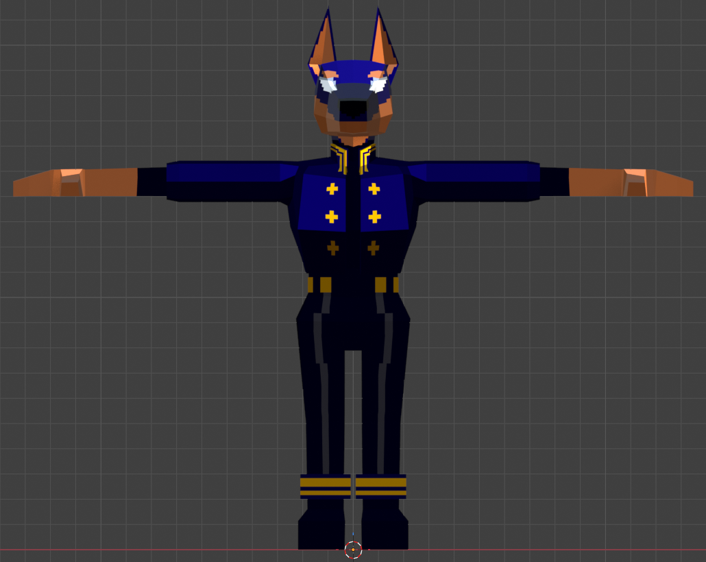
[image description: Three process images of the textures: just the base (now with eyes), bright clothes with accompnaying base nodes, and finally a front view with everything together in final colors.]
…aaand we landed here! Some tweaks were made along the way: decided to just use one full-color image for the base texture, simplified the ear polygons, and the belt-metal got split off. An unintended side effect of how I set up the textures is that (not shown) the clothing, particularly on the ankle, shines very blue in the light. The tint is not supposed to be that strong. Oh well.
I also considered throwing in some subtle anti-aliasing to round out the markings and buttons, but quickly realized that if I wanted that to look consistent I’d need to anti-alias the rest of it, and I wanted to start making this sucker move.
It’d been a week, at this point, of doing basically nothing else with my spare waking hours. Perfectionism gnawed. It is good to remember, with any novel pursuit, that one’s first forays into the thing are always going to be the “worst.” It does not need to be Super Shiny Professional Polished 64. It only has to be done.
Finished, not perfect. Aaaaaaaaaaaa.
Why not take a break?
I don’t do breaks I hyperfocus and die. (or: I know myself and prolonged “breaks” tend to be a death knell.) Next question.
making the sucker move
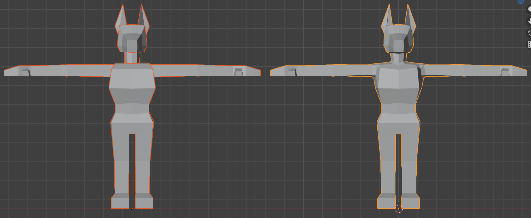
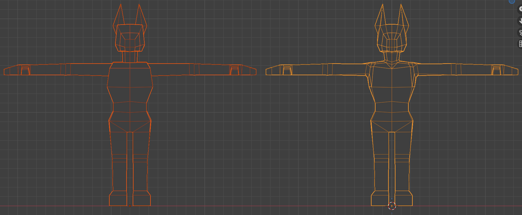
Not that I’ve been consistent with my file version breakpoints ever, but about 11 of the 32 .blend files constructing this thing were devoted entirely to rigging. Y’know, the model inside the model that actually animates. The rig. The process of rigging. Making the rig. And bugtesting the rig. And fixing the rig. And tweaking the rig. And—
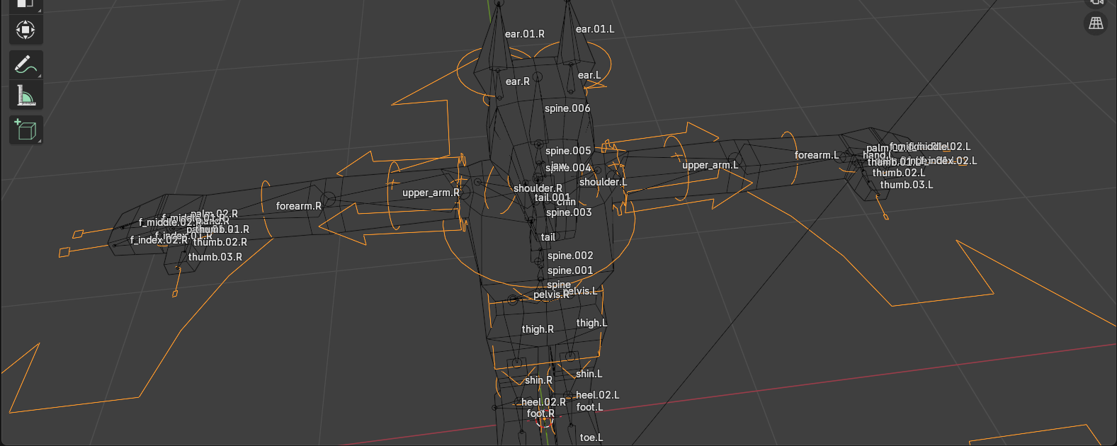
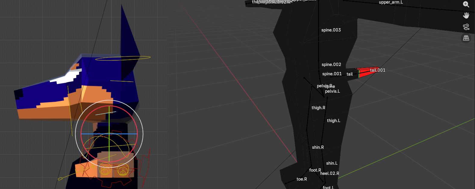
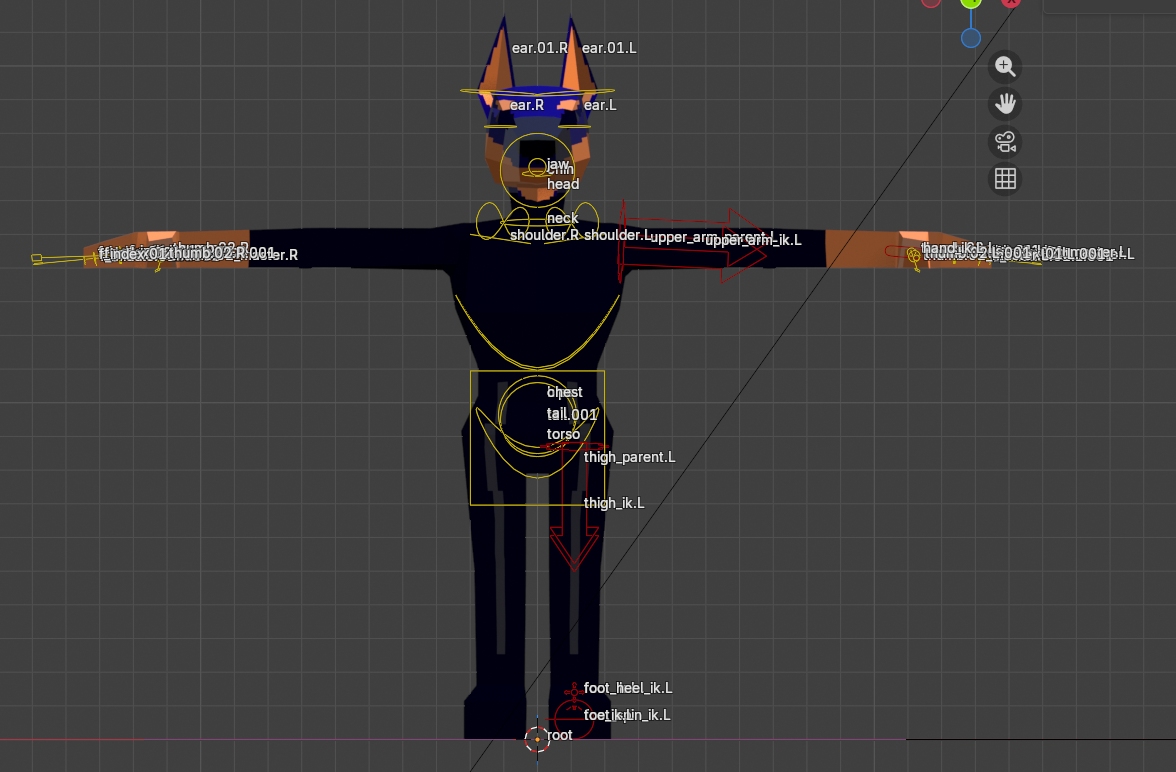
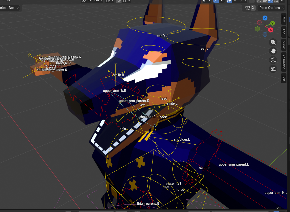
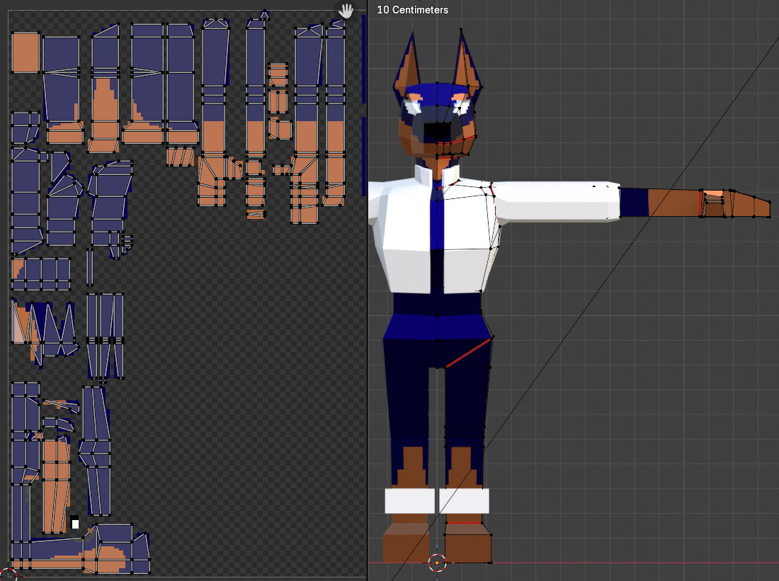
I don’t remember what the fuck I was doing with most of these sub-files, so here’s a compilation of views that I last saved them on. The (flat) teeth got added in the process.
An annoying thing with rigging is that it’s A Lot Of Tedium and not the fun kind. (Er, I think certain kinds of tedium are fun, anyway. Coding, for instance. Creative problem-solving. Mindless pixel-pushing, even. Rigging is, in my experience so far, mostly just clicking points in ways that should make them do the thing, and then trying to reverse-engineer why they are not doing the thing.) It’s also not super amenable to being shown visually.
Look, uhh, here’s the Crashsune tutorial segment on weight painting. That’s the bit I’m complaining about, mostly. I am extremely glad that this tutorial introduced me to Rigify, which auto-generates all the fancy bone movement bits and eliminates that entire chunk of tedium—even though it introduces its own overwhelm, such as, uh…
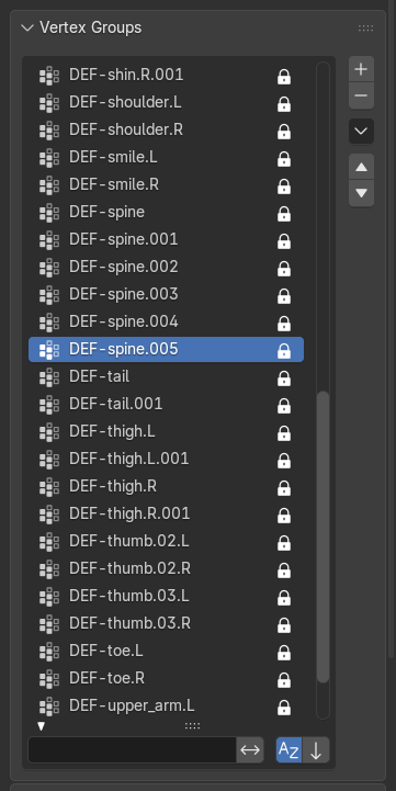
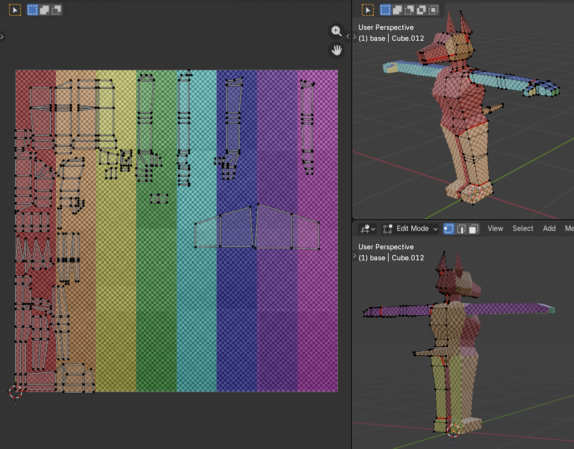
[image description: A listing of auto-generated vertex groups, including but not limited to: DEF-spine.001, DEF-spine.002, DEF-spine.003, DEF-spine.004… you get the idea. Also tails and thighs and thumbs.]
I’m not advanced enough for this help
I do feel a bit like this is the equivalent of using Bootstrap and a CMS for a static two-page site—sorry, in plain less-nerdy English, it’s a bit like going “I would like to play piano,” being directed to a piano, and you can start plinking away but in the process of learning how to play well you also need to know exactly how each string is tuned, the wood the piano was crafted from, how the angle of the thingamabob affects the doohickey, and also if you want to play one or two specific notes you need to carve them out from scratch by ripping the material from a tree raw with your bare hands.
I did the equivalent of duct-taping sticks to a pre-built sandcastle and moved along, satisfied with my efforts and ready to make the silly little animations of my dreams oh wait no I didn’t
the eyes.
Remember how I drew attention to the eyes (lack thereof) in the planning phase? This is the part where it comes back to haunt me.
You see, the OG tutorial series uses flat textures for the entire face. This is simple and easy to accomplish, because the character’s face is mostly a single flat plane, anime-style. There’s a later addendum in which the irises are made moveable, which is also (relatively) simple and easy to modify, because the entirety of the eyes fit onto one (1) plane.
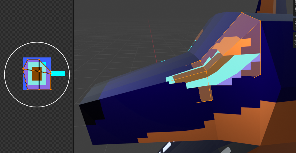
[image description: A close-up on the eye and its UV+texture. There are four planes.]
This is not the case for me.
I did, demonstrating some stray crumbs of forethought, make the eye area of the base texture transparent, and use a separate object underneath for the sclerae. Did I account for the multi-planar nature of the thing no. Did it take one simple easy try to get it right no. Did I manage to make the irises moveable, in a way that made sense from both front and side views, with nice smooth animation and everything oh. Surely you jest. (read: No.)
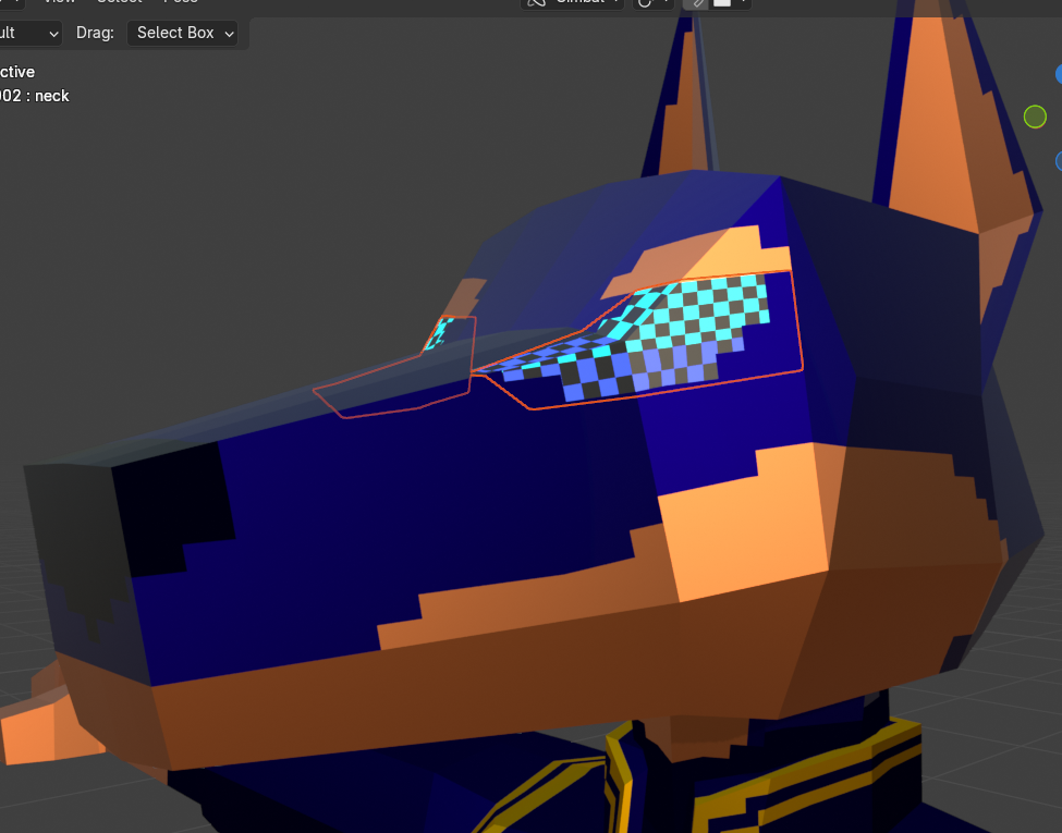
[image description: ////]
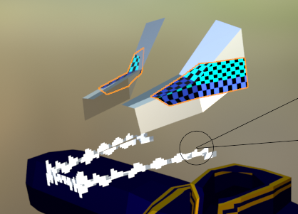
A couple upright planes of teeth got added along the way. As a break from the (eye) horrors.
Eventually. Eventually. Several false starts and glitched-to-all-hell attempts later. I settled on making the entire* eye area (*inner! the brows are a different part!!) a flat, swappable texture. It basically follows the tutorial’s face-swap technique but just for the irises. I didn’t love the node redundancy, though, so after scavenging elsewhere and the tutorial’s comments, I found this stupid simple method from @gibbhartin643:
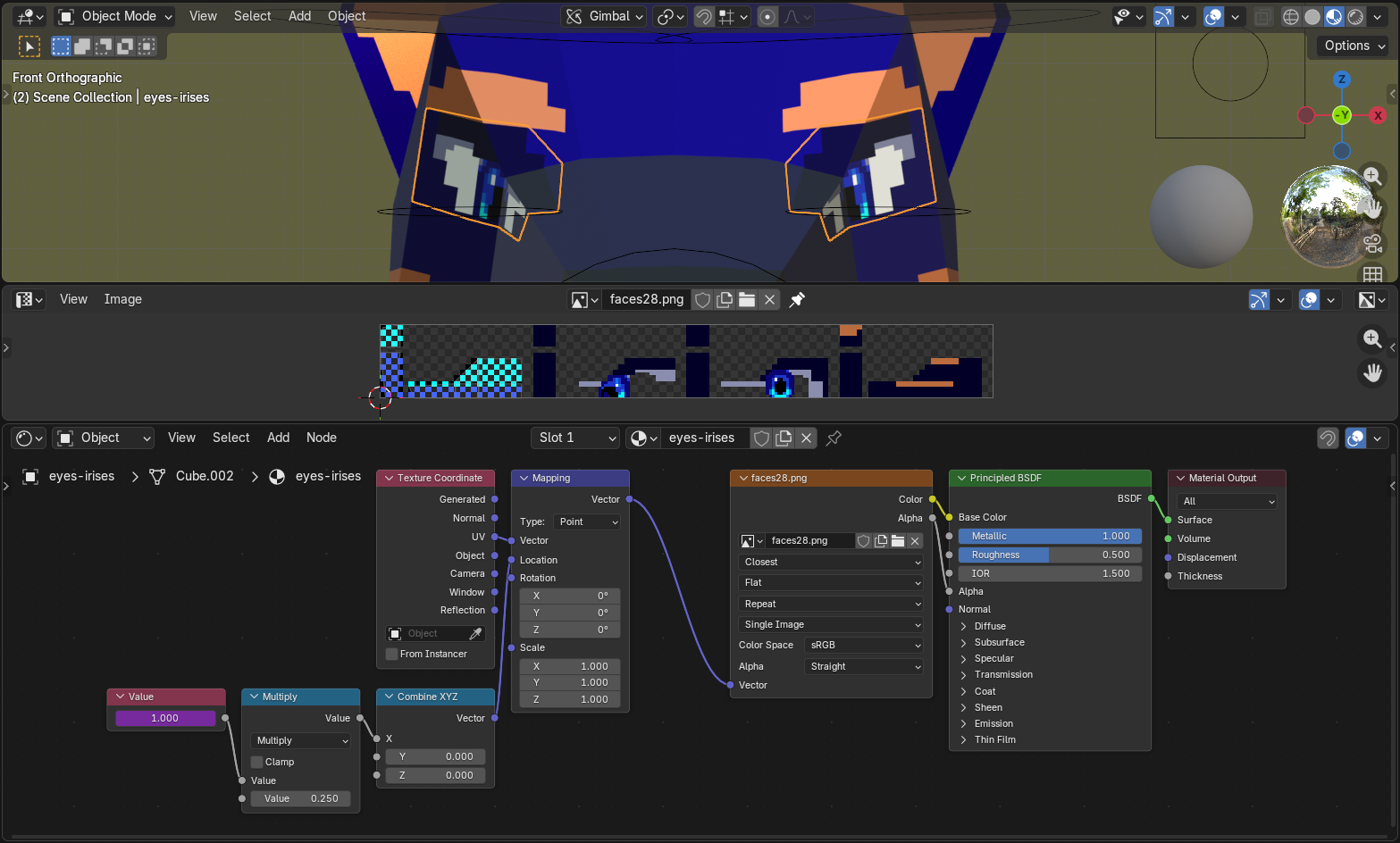
[image description: A preview of how the eyes ended up working: a close-up of the model itself, the texture image, and the node setup (described below).]
you dont even need that [many nodes] really
1) Value node (face count for either x or y)
2) Multiply node (value 1 is value node, value 2 is distance per face)
3) combine xyz (plug into either x or y for respective direction)
4) mapping location node
Should note: The Multiply value is 1 divided by the # of sprites there are to cycle through, in this case 4. Spacing between the sprites needs to be exact; if there’s any margin between them, that gap needs to be duplicated on the sides of the image, or it won’t line up right.
Now I have to redraw the texture every time I want the eyes to do something different, but. but. it does “work.”
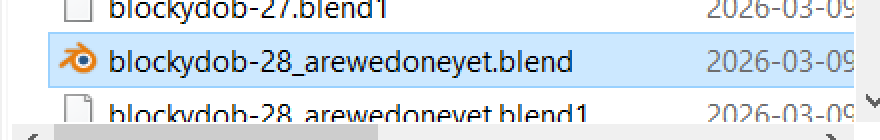
[image description: Snippet of the Windows 10 file explorer, ft. the file "blockydob-28_arewedoneyet.blend"]
Also I never applied the Mirror modifier so I’d have to re-wrangle everythign to make the eyes not exactly the same on both sides lol anyway—
“final” render
Step one: Make boat.
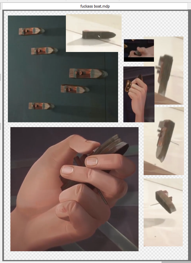
[image description: Screenshot references for and the model of a boat figurine Caitlyn holds in one scene.]
“did you use a reference compilation like this for the actual character” no.
(I skimmed a handful of image search results for the initial high-poly attempt, have drawn the (human) character a good handful of times, and the rest was between me and 32 .blend files.)
Step two: Make the rest of the fuckign render.
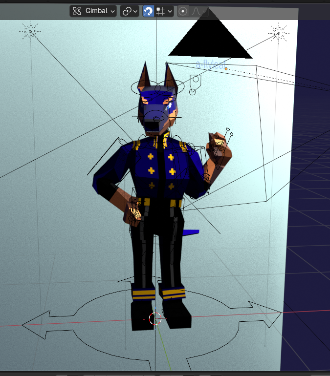
[image description: The setup for the final gif, as seen from the Blender file with lights, rig, and background plane visible.]
There were a couple scrapped attempts at different lighting setups & some slight movement (since, y’know, it’s a fully-rigged model that can animate), but I truly was nearing the Sick Of Looking At This point and didn’t want to end on a bitter note. Ultimately I settled on lighting that attempts to mimic the 3D Viewport’s material view, threw in a slight side-shifting camera movement (which, hey, is the exact effect I talked about (but didn’t know how to implement) last time…!), aaaand…
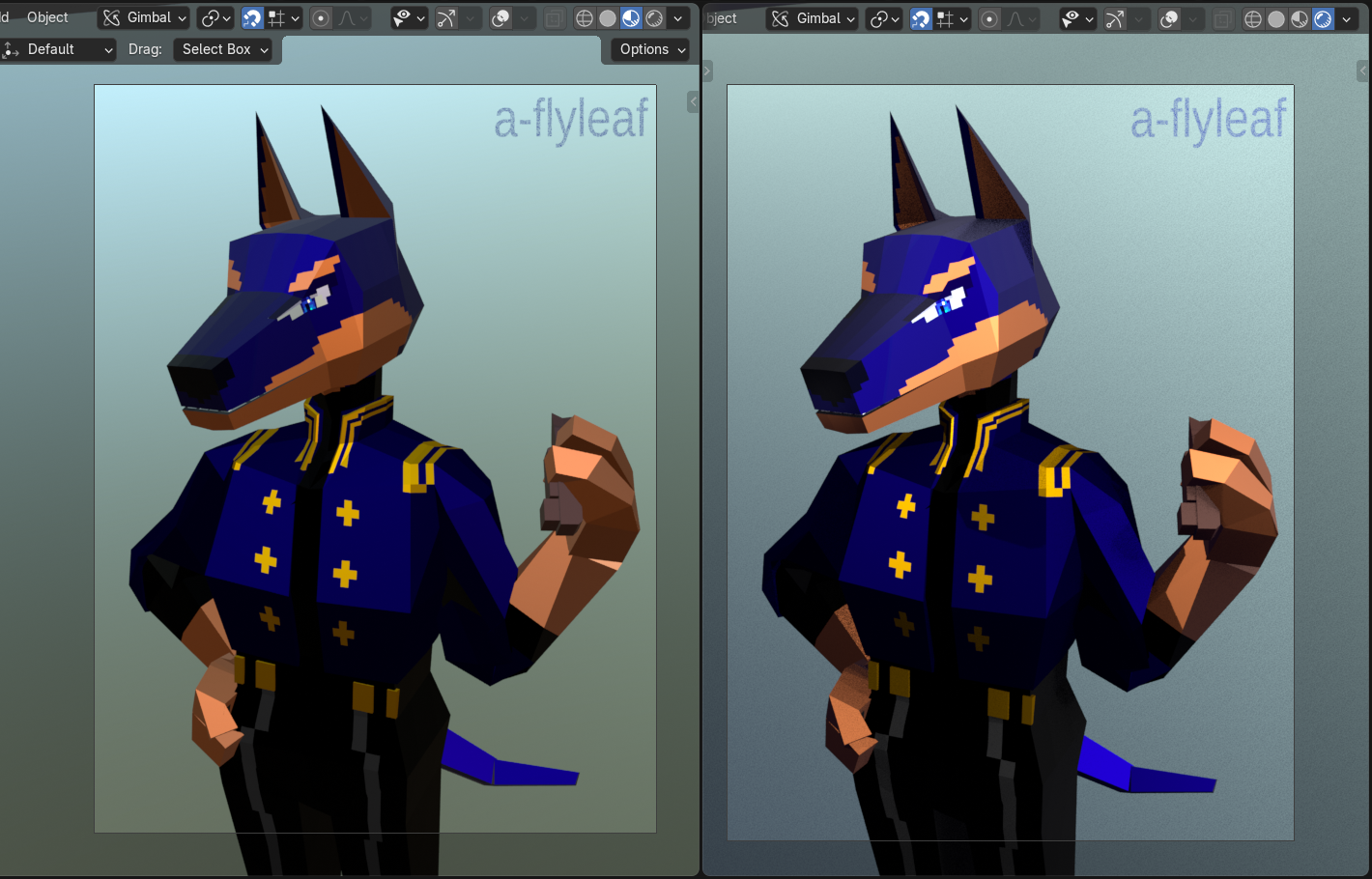
[image description: Two static views of the final render:]
Left is the Material Preview, right is the Rendered preview. The background gradient hue is slightly different because the material mode uses the default gray background, and the plane is slightly reflective. Also, yes, I stuck the watermark directly in the scene.
if you perceive clipping no you don’t <3
(for now.)
postscript
Good fucking lord I learned a lot with this. Have some notes-to-self.
Lots of them.
- Plan. the face. in advance.
- Palette would also be nice to have down in advance. It is much, much easier to tweak the colors in a 2D program & re-export the texture than to modify them in the node editor on the fly—although I’m glad I learned how!
- I did not need to go that hard on making the model vertices imprecise. I like the idea of it, but I don’t have a trained enough eye to know if it makes a difference in the final not-Perspective-view result. Could maybe be accomplished in future renders by doing everything ~pixel-perfect, then applying some kind of vertex deformation on top of everything else?
- Low-poly joints are weird. Mess with and/or research corner edge loops more to get a feel for how different edges deform.
- If it’s not visible don’t Fuckign worry too much about it. Applies to, say, UV pixel alignment where there will not actually be pixel edges; overlapping UVs in general; possibly even modeling entire body parts where clothes will cover them later.
- untested thought: Use a texture for covered body parts (limbs, namely) & make it transparent when clothes are on. There will still technically be clipping, but you won’t see it!
- The entire model can be rigged (and moved asymmetrically!) without applying the Mirror modifier, but you need to apply it to the eyes (independent! movement!! e.g. both looking leftward) & clothing (necessary for proper shape keys) or they’ll look weird.
- Save yourself a headache and screenshot where all the rigify bones go once they’re positioned, both on the metarig and result. And/or try making an armature from scratch again. Homebrewing it is more tedious, but you’ll have a better idea of what goes where.
- Note what changes along the way! Doesn’t have to turn into a big process page like this, but it’s just useful to have.
I am not not tempted to go back and redo some parts that are irking me here (face. but also smaller details around the joints, maybe add that antialiasing; the textures ended up a nightmare with multiple semi-overlapping images, and can absolutely be simplified) but. but but but. All of that would involve non-small & possibly-destructive changes to the model that I Don’t Want To Do Right Now. They are things that I am filing squarely under Learning Experience, will keep in mind moving forward, and whether I revisit this with improvements or (if enough time has passed & I’m substantially better at 3D by then) from scratch is up to future me.
Current-me out.
bonus features for your bonus feature
Overall time taken, not including preliminaries, concept sketches, or this page: a little over 40 hours. yeagh....
Have some screenshots that didn’t fit anywhere above.
Thanks for reading~